Covenant Eyes · Lead product designer · 2021–2022
The Victory App
Real-time accountability and support, from concept to launch
Summary
Covenant Eyes helps people quit porn through accountability: someone they trust, called an ally, sees what they do online. For 20 years that meant a report in the ally’s inbox, after the fact. Victory replaced it with an app that shows activity as it happens, tells allies what it means and what to do next, and teaches them how to help.
My role. Lead product designer, from the first concept through launch: research, information architecture, prototyping, user testing, visual design, and the brand, then support through deployment. I worked with a small team, including my UX research partner, Katie Oeschger.
- Timeline
- October 2021 to launch in April 2022
- Team
- Me, my UX research partner, and a small product team
- Users
- People quitting porn, and the allies who support them
- Client
- Covenant Eyes
- 4.7★ on both the App Store and Google Play
- ~90% of allies read the new summary correctly in testing
- ~70% of allies needed only the new summary, in a 1,295-ally study
The problem
Accountability that arrived after the fact
Quitting porn is hard enough before software gets involved. People have to own up to the problem, hold themselves to changing, and trust someone else with a very personal secret. Covenant Eyes’ job is to make that last part work, and for about 20 years it did it the same way: it monitored a person’s devices and emailed a report to their ally.
By the time a report arrived, whatever it described had already happened, sometimes long before, and nothing prompted a conversation while it still mattered. Allies also got little help reading reports or deciding what to do about them. Covenant Eyes wanted accountability in real time, education for allies built in, and a brand that felt like empathy and hope rather than surveillance.
The concept
Real-time accountability, pitched as “Integrity”
Victory is always on. Allies see device activity as it comes in and get notified when something needs their attention, so they can step in while it counts. Alongside that sits a library of education and training for both sides of the relationship. Before it was Victory, we pitched it under the code name Integrity.
 Play video: Victory concept pitch video
Process
Personas first, then wireframes
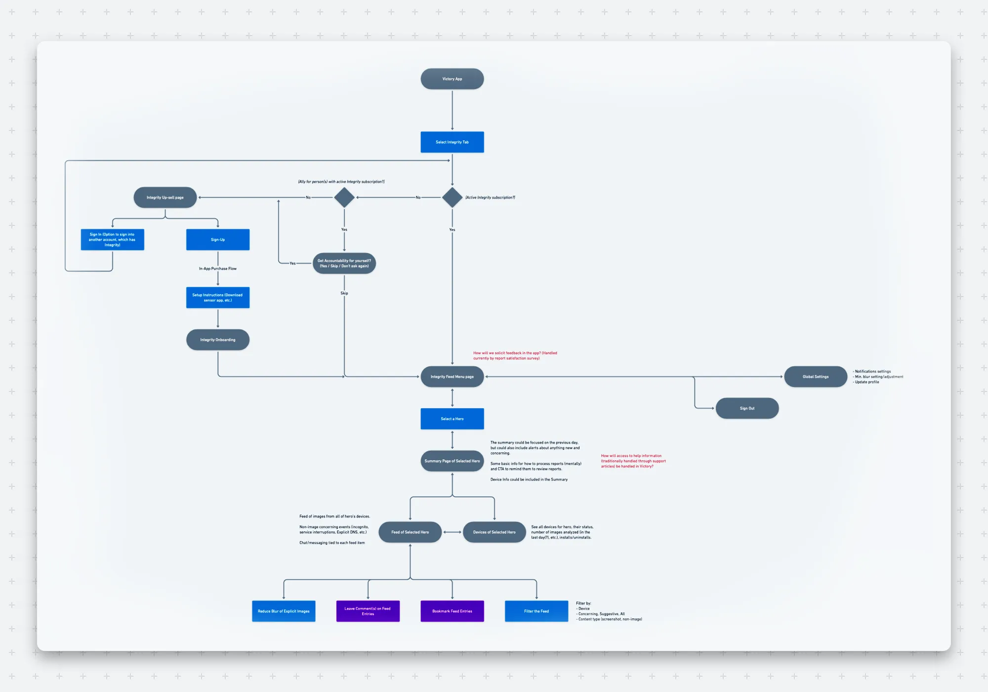
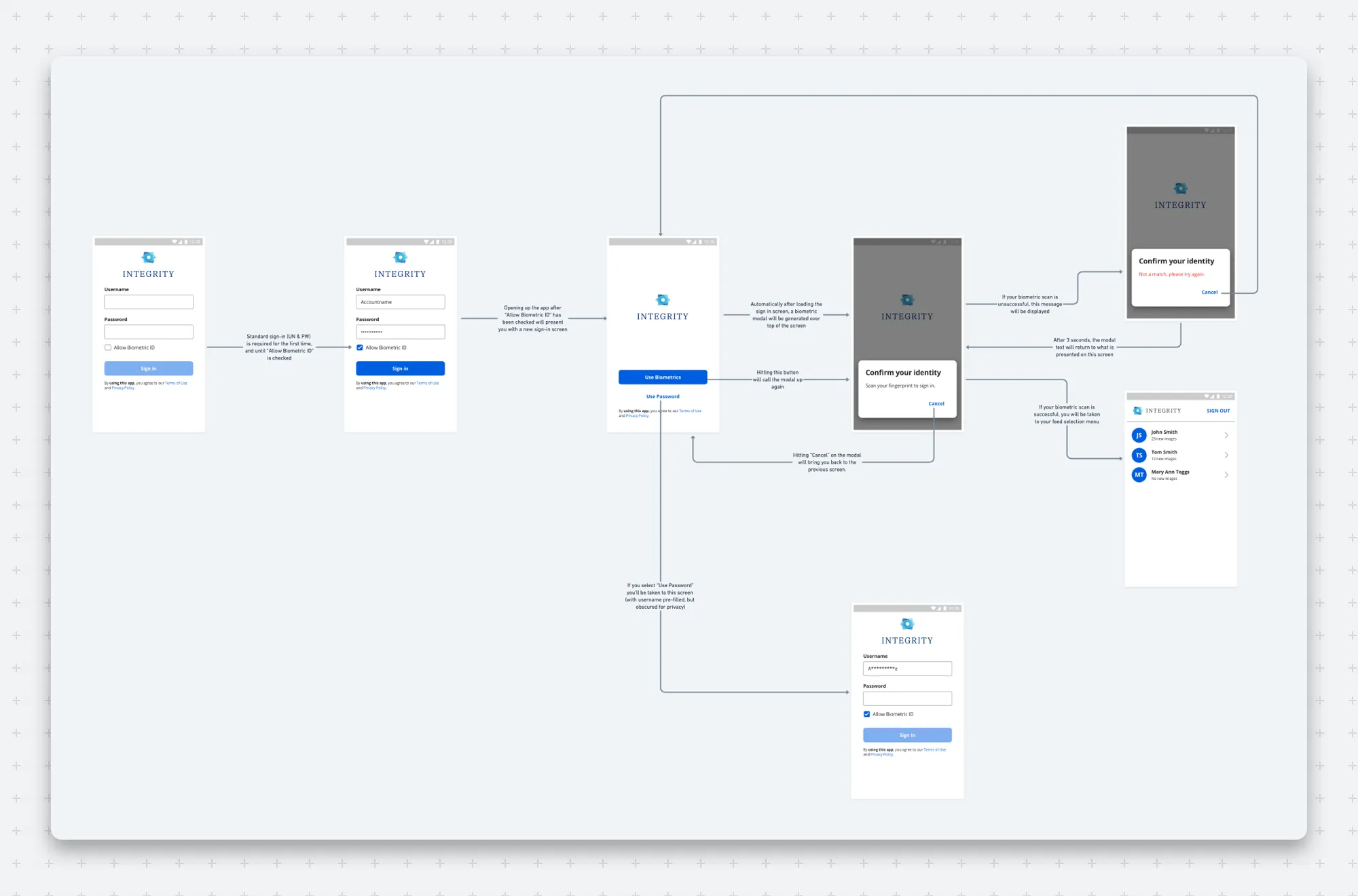
We built personas from scratch out of customer interviews and survey data, and they guided the wireframes from the start. From there we iterated through prototypes and observational user testing until the designs held up with real customers.
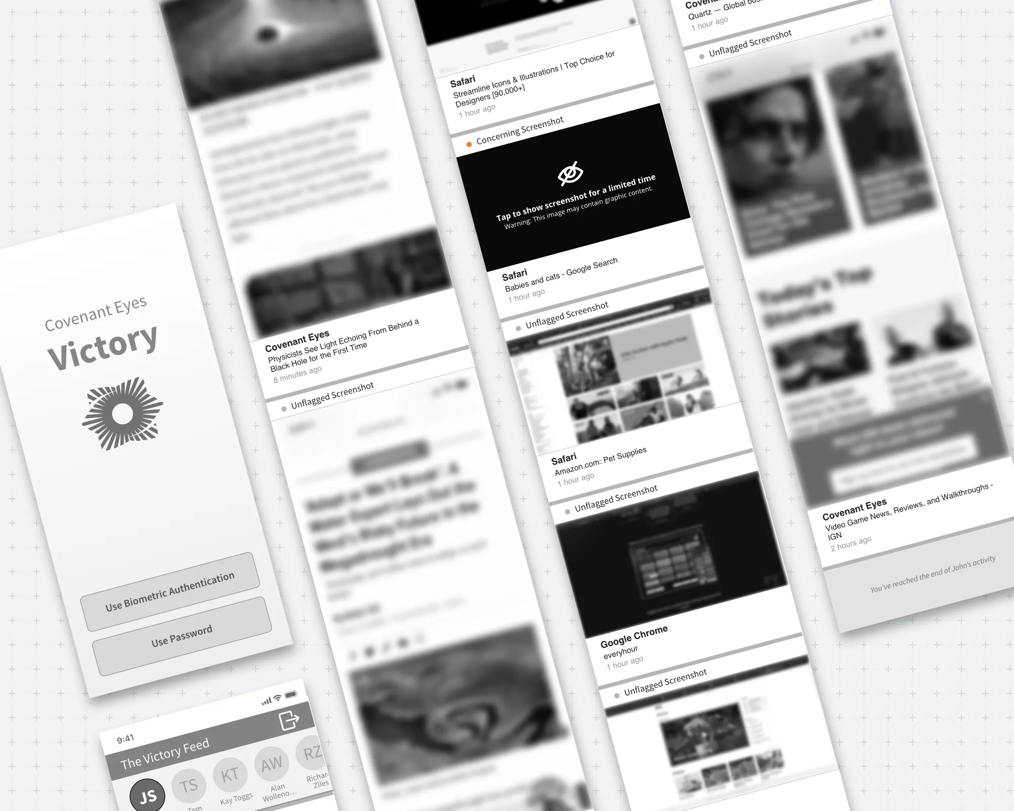
At the same time, we gathered two decades of Covenant Eyes’ accountability knowledge into a learning library inside the app, written to help allies support people with empathy instead of alarm. I led the brand alongside the product: the brand guide, the illustrations, and the styling of every UI component, all aimed at friendliness, empathy, and hope.
Research
Three questions every ally asks
Our research showed that strong allies went hand in hand with long-term success, so the ally’s experience got as much attention as the user’s. Allies kept asking the same three things: Should I be concerned? What happened? What do I do now? We designed a summary module to answer all three in one place, and Katie and I ran two studies to find out whether it did.
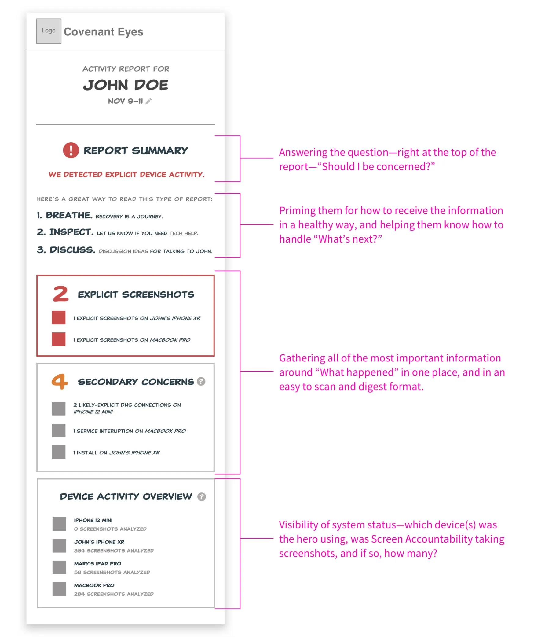
Study 1: three designs, 28 allies
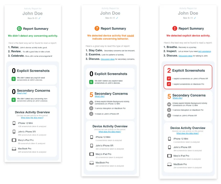
Twenty-eight allies took part in unmoderated tests on UserTesting.com. Each saw one of three reports: Design Concept 1, Design Concept 2, or the report they already got, as a control. We measured how accurately and easily they could judge someone’s recent activity.
- Every participant read Design Concept 2 correctly (100%, against about 85% for the current report).
- They rated it 4.7 out of 5 for ease of use and for confidence in their reading, against 4.1 and 4.2 for the current report.
- The summary module itself was the standout: 24% named it the most important feature, and the control group asked for clearer summaries without being prompted.
| Group | Value |
|---|---|
| Design Concept 1 | 77.8% |
| Design Concept 2 | 100% |
| Current report (control) | 84.6% |
| Group | Ease of use | Confidence in their reading |
|---|---|---|
| Design Concept 1 | 4.0 | 4.2 |
| Design Concept 2 | 4.7 | 4.7 |
| Current report (control) | 4.1 | 4.2 |
Study 2: two iterations, 1,295 allies
We turned what we learned into two new iterations of Design Concept 2 and surveyed 1,295 current allies, each randomly assigned one of them. This round put the summary into the emailed report allies already knew.
- About 70% of allies were finished after the summary alone. They knew whether to be concerned without opening the full report.
- Allies read it correctly about 90% of the time.
- More than 80% said they’d opt in to the new design.
| Group | Iteration 1 | Iteration 2 |
|---|---|---|
| I’m finished. I know whether I’m concerned. | 73.4% | 69.1% |
| I know, but I’d still open the full report. | 17.7% | 22.5% |
| I need more data first. | 6.4% | 6.2% |
| Other | 2.5% | 2.2% |
| Group | Value |
|---|---|
| Iteration 1 | 90.7% |
| Iteration 2 | 89.1% |
The design
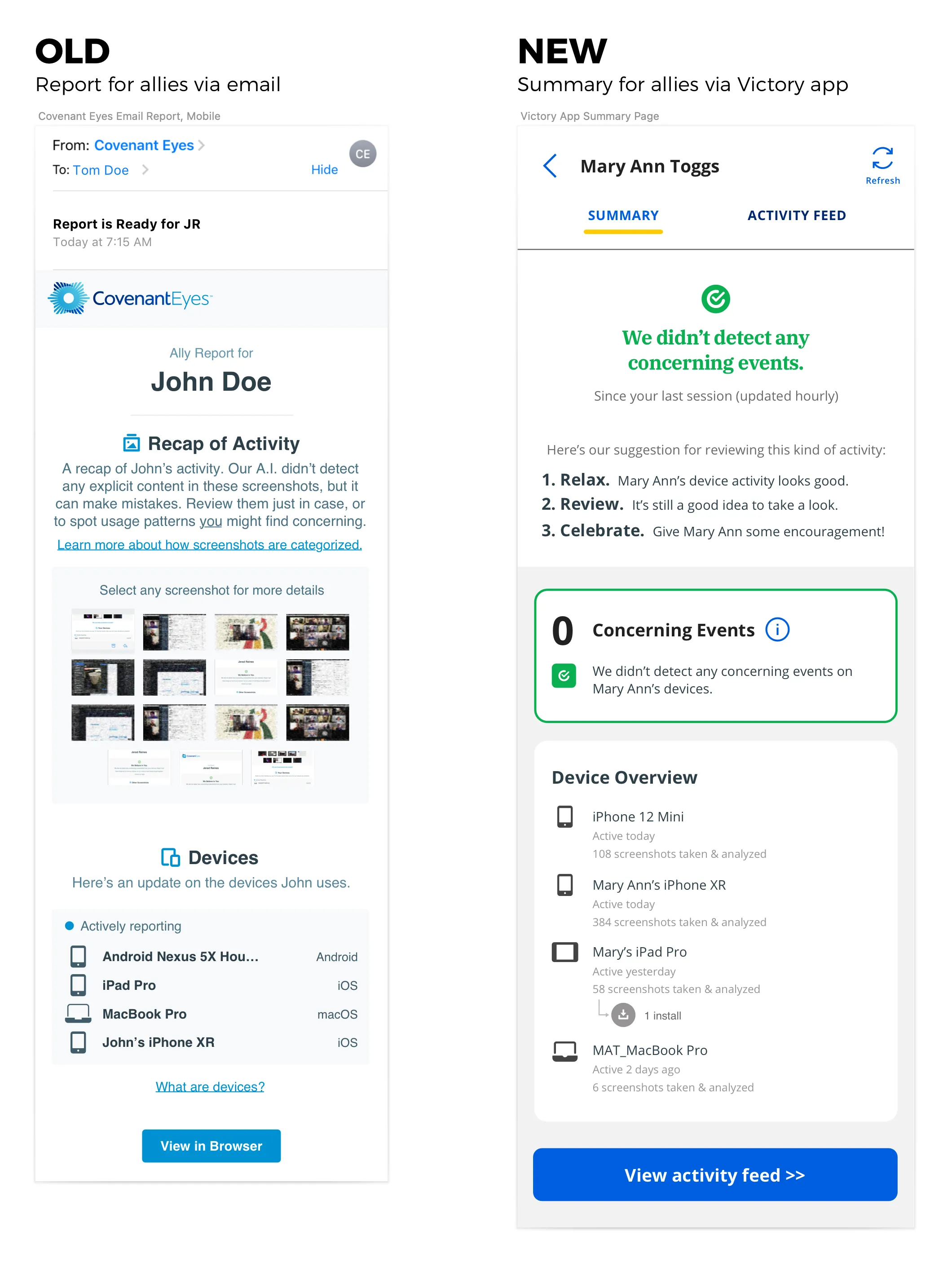
From an emailed report to a check-in
The summary became the first thing an ally sees in Victory. Instead of a grid of screenshots to sort through, it opens on an answer, a few steps for handling it well, and only then the detail.
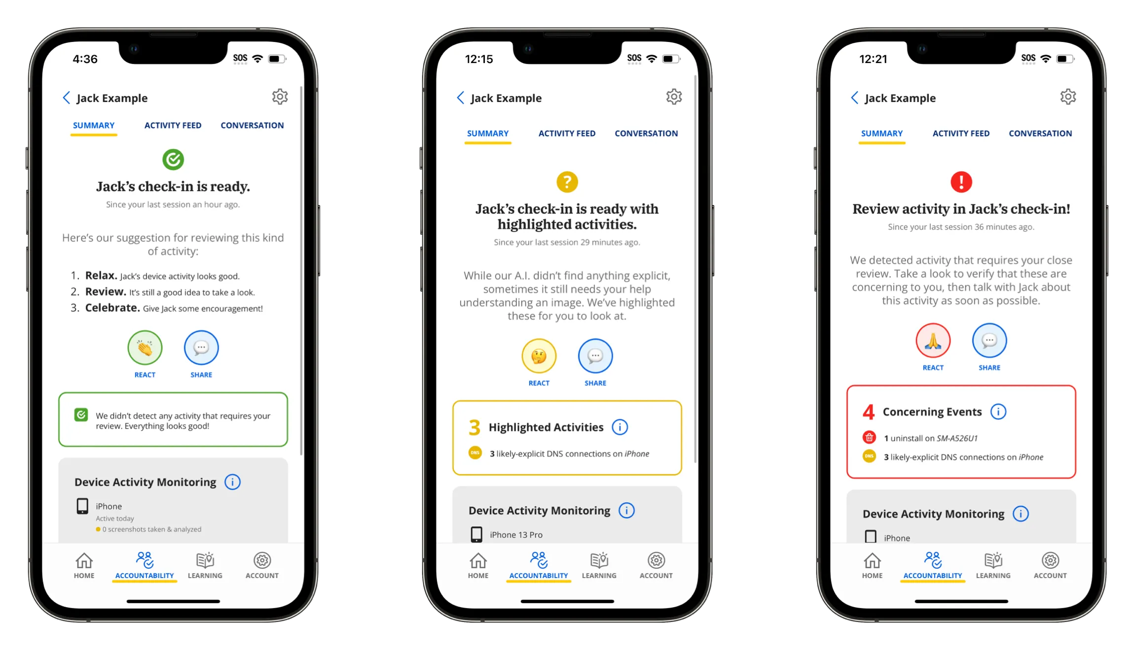
 Play video: Victory app walkthrough
Launch
Asking loyal customers to change
Covenant Eyes’ customers were famously loyal. At the time, the average subscription had run for nearly 36 months, and we were asking those people to relearn how accountability worked. There was pushback at first, and we lost some long-time accounts. As design lead, that felt shaky. The executive team believed in the vision and backed it fully.
To ease the change, I helped shape a series of publicly streamed “fireside chats,” contributing ideas and visuals, where we explained the reasons for the shift and took questions live. The rollout also had a period when both the old reports and Victory were available, so customers could get used to it before the switch. Along with other efforts the executive team led, that made for a smooth rollout, and a new wave of customers welcomed the modernized product.
Results
Victory became how Covenant Eyes delivers accountability
- Victory replaced the emailed report as Covenant Eyes’ only accountability delivery method.
- As of October 2026, it’s rated 4.7 stars on both the App Store (1,400 ratings) and Google Play (2,100).
- It beat the projected goals for adoption, retention, and new-user satisfaction.
We need community to succeed in this fight and this app equips us to easily look out for each other. This is a big step forward for phone accountability.