MY ROLE
As the Lead Product Designer on the project, I led the research, analysis, concept development, and implementation phases of the project. Collaborating closely with CE leadership—specifically Scott McClurg the VP of Sales and Marketing—and leveraging user feedback, I steered the project from start to finish, delivering a streamlined and user-friendly sign-up flow that surpassed business objectives and resonated with our customers.
Covenant Eyes Sign-up
Paving the way for easy accountability
OVERVIEW
Covenant Eyes is an industry-leading software subscription service that uses the power of accountability relationships to help people overcome pornography addiction. This project is the account of revamping their sign-up process with the goal of simplifying it, reducing complexity and confusion, and ultimately increasing conversions—from 15% (yikes) to 25%, or higher. Through a systematic approach of testing and iteration, we successfully redesigned the sign-up flow, resulting in significant improvements in user satisfaction and an over 10% long-term increase in conversion rates.
CLIENT
Covenant Eyes
TOP 3 ACCOMPLISHMENTS
-
Substantial Increase in Conversion Rates: The redesigned sign-up process led to a significant increase in conversion rates, initially reaching nearly 40% and stabilizing around 30%. This achievement signifies the project's success in simplifying the process and reducing barriers to entry, resulting in more users successfully signing up for the service.
-
Significantly Reduced Sign-Up Time: The revamped process reduced sign-up time by over 40%, enhancing the overall user experience and minimizing frustration. This improvement directly addresses one of the main pain points identified in the initial analysis and demonstrates the project's effectiveness in streamlining the user journey.
-
Improved Customer Satisfaction and Confidence: The project resulted in improved customer satisfaction scores, with a nearly 70% increase in customer confidence in completing the sign-up correctly. This achievement highlights the success of instilling trust in the sign-up process, ultimately contributing to higher conversion rates and better user retention.
Challenge
When I first embarked on the journey to overhaul Covenant Eyes' sign-up process, I quickly realized how out-of-date and out-of-touch it was in terms of meeting our customers wants and needs. Our existing process, with its convoluted paths and confusing terminology, was leading to a unsatisfying conversion rate of just 15%. With an average of over 30 touch points throughout the process, our potential customers found themselves lost in a sea of steps, often abandoning ship midway through due to confusion or sheer frustration. Feedback from surveys and observational research echoed these sentiments, revealing a laundry list of grievances ranging from excessive personal information demands to archaic form design. It was clear that a radical transformation was needed to breathe new life into our sign-up experience.
The Problems to Solve
-
A low conversion rate of around only 15%.
-
An excessive number of steps leading to customer frustration.
-
Timeout issues causing loss of progress.
-
Confusion reported by users on multiple steps.
-
Outdated form design lacking modern amenities.
-
Overly stringent password requirements.
-
Lengthy process requiring excessive personal user info.
Solution
I began the redesign journey through a series of explorations to identify what pains our customers were experiencing, as well as uncover the best practices of sign-up flows for online subscription services. Collaborating closely with our UX Research team, I delved into the minds of our potential customers through 3 observational testing sessions with potential customers, seeking to unravel the mysteries of their sign-up woes. We followed up this exploration with some concept usability testing. Our approach was to break down our major sign-up improvement ideas into distinct, individual chunks that could be tested in isolation to determine their impact on conversion.
The first test moved the payment entry part of the process to the front of sign-up (while keeping everything else as unchanged as possible from the current state). We tested this change and saw a bump in conversion rate to ~17%. The second test we conducted was to simplify our service offering (which offered customers 3 plans to choose from) to a single product for one set price—with everything else left unchanged. This test got us to a nearly 20% conversion rate. Based on the results of test two, our executives decided to approve the decision to move forward with the single product/single price framework, but to do a fully-optimized and comprehensive update to sign-up. This decision was made possible because of the strong case we were able to make for sweeping change due to the large amount of customer feedback and my heuristic and usability audit of our current process that uncovered more than 60 pain points (areas that needed improvement).
Armed with insights gathered from real-world observations and competitor analysis, I set out to craft a solution that would not just address, but surpass expectations. Through a process of iterative design and testing, we fleshed out the concept we had dubbed "One Product, One Price". We stripped away the layers of complexity, reducing required form fields and eliminating unnecessary steps. The result was a streamlined sign-up journey that empowered users, reduced frustration, and ultimately catapulted our conversion rates to new heights.


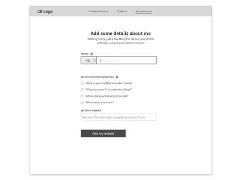
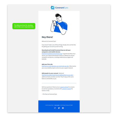
These are the final sign-up wireframes used to inform the architecture of the design, utilizing a "one plan, one price" strategy. Tap on an image for a larger view.
This video is an overview of the five main wireframe concepts I explored and did testing with to arrive at the final design.


Decisions, Decisions...
Audits & Evaluation: The Backbone of the Project
The heuristic evaluation and usability audit of Covenant Eyes' current sign-up process played a crucial role in shaping the trajectory of our redesign efforts. Rather than opting for quick fixes or superficial changes, conducting a thorough evaluation allowed us to delve deep into the root causes of user dissatisfaction and inefficiencies. By applying established usability principles and scrutinizing every aspect of the user journey, we unearthed a myriad of pain points and opportunities for improvement.
These evaluations not only highlighted glaring issues such as confusing jargon, excessive form fields, and lack of real-time feedback but also provided valuable insights into user behavior and expectations. Armed with this comprehensive understanding, we were able to craft a solution that addressed not just the symptoms, but the underlying issues plaguing the sign-up process.
Importantly, the heuristic evaluation and usability audit steered us away from mere "band-aid" fixes towards a holistic redesign strategy. Rather than patching up isolated problems, we took a systemic approach, reimagining the entire sign-up flow from the ground up. This approach ensured that our solution was not just a temporary workaround but a sustainable and future-proofed design that would stand the test of time.
Ultimately, the audit and evaluation served as the cornerstone of our redesign efforts, guiding us towards a comprehensive solution that not only met but exceeded user expectations. By prioritizing user needs and addressing fundamental usability issues, we were able to create a sign-up process that was not just functional, but delightful—a testament to the power of thorough evaluation in driving meaningful design improvements.

Results
The redesigned sign-up process yielded substantial benefits for both the business and our customers:
-
Conversion rates increased to nearly 40% initially, stabilizing around 30% six months post-launch.
-
Significantly reduced sign-up time—by over 40%—enhancing user experience and reducing frustration.
-
Improved customer satisfaction scores, with a nearly 70% increase in customer confidence in completing the sign-up correctly.
-
Clear and concise communication resulted in a process that respected users' time and minimized confusion.
In conclusion, the UX redesign of the sign-up process at Covenant Eyes was instrumental in achieving our goals of simplification, increased conversions, and improved user satisfaction. By prioritizing user needs and iteratively refining the design, we created a streamlined and user-friendly experience that benefits both our business and our customers.

Secondary Research Findings
Applied Insights
-
The Baymard Institute analyzed checkout forms and found that a checkout process that is too long or too complicated is one of the top reasons for abandonment during checkout.
-
Lengthy sentences and dense blocks of text overwhelm the reader. Content will be more coherent, engaging, and precise by carefully removing unneeded words.
-
Show visual indicators of security. A recent study by Baymard Institue revealed that 17% of shoppers left a page without paying due to security concerns.
-
Specify inline errors where they occur and with the reason. Don’t wait until the user attempts to submit to report errors.
-
Don’t forget to thank customers for the time they spent getting through the sign-up process.
-
According to a study by Adobe, 38% of people will stop engaging with a page if the content or layout is unattractive.
-
Eliminate uncertainty on CTAs. In a study conducted by Unbounce, they found that changing “start your free trial” to “start my free trial” increased clicks of the call to action by 90%.
-
Cut ruthlessly! Every word, image, link, or “feature” that isn’t 100% necessary will decrease your form’s conversion rate.
-
Less form fields equals a better UX experience and higher conversion rates. Based on a Baymard Institute benchmark, the average checkout flow contains 14.88 form fields (when purchasing as a new, non-account customer), yet a fully optimized checkout flow can be as short as 7 form fields.
Hungry for more?


This gallery shows the basic steps to the Covenant Eyes sign-up process before the project. As you can see, there's a lot of reading required, tons of form interaction, and confusing jargon. Lots of room for improvement.
Covenant Eyes Sign-up
Paving the way for easy accountability
OVERVIEW
Covenant Eyes is an industry-leading software subscription service that uses the power of accountability relationships to help people overcome pornography addiction. This project is the account of revamping their sign-up process with the goal of simplifying it, reducing complexity and confusion, and ultimately increasing conversions—from 15% (yikes) to 25%, or higher. Through a systematic approach of testing and iteration, we successfully redesigned the sign-up flow, resulting in significant improvements in user satisfaction and an over 10% long-term increase in conversion rates.
CLIENT
Covenant Eyes
MY ROLE
As the Lead Product Designer on the project, I led the research, analysis, concept development, and implementation phases of the project. Collaborating closely with CE leadership—specifically Scott McClurg the VP of Sales and Marketing—and leveraging user feedback, I steered the project from start to finish, delivering a streamlined and user-friendly sign-up flow that surpassed business objectives and resonated with our customers.
TOP 3 ACCOMPLISHMENTS
-
Substantial Increase in Conversion Rates: The redesigned sign-up process led to a significant increase in conversion rates, initially reaching nearly 40% and stabilizing around 30%. This achievement signifies the project's success in simplifying the process and reducing barriers to entry, resulting in more users successfully signing up for the service.
-
Significantly Reduced Sign-Up Time: The revamped process reduced sign-up time by over 40%, enhancing the overall user experience and minimizing frustration. This improvement directly addresses one of the main pain points identified in the initial analysis and demonstrates the project's effectiveness in streamlining the user journey.
-
Improved Customer Satisfaction and Confidence: The project resulted in improved customer satisfaction scores, with a nearly 70% increase in customer confidence in completing the sign-up correctly. This achievement highlights the success of instilling trust in the sign-up process, ultimately contributing to higher conversion rates and better user retention.

